Convert Page Visitors into Paying Customers: Upgrade to the Brand New bookingkit Today
Product & Partners


The brand new booking kit has arrived! And with it’s simple, clean and modern design — not to mention 2.0 updates for the platform’s checkout system and website widget — it’s the best looking and best performing bookingkit to date.
The new look draws more attention to your tours and activities, coupons and gift certificates and add-on products, and uses more enticing visuals to make sure visitors stick around and book a tour or two. This means more clicks, more bookings and more revenue for you — and a much more satisfying user experience for your customers. But wait, there’s more!
Widget 2.0
The widget is a bookingkit module which can be added to your website to allow visitors to book tours and
activities.
Checkout 2.0
The checkout displays the tours, activities and add-on products that the user has decided to book.
Better mobile functionality, better SEO performance, perfect integration
The new bookingkit design isn’t just about giving your customers a great visual experience. We’ve also packed some cool features under the hood to make it the easiest and most powerful bookingkit ever. The first of these features is optimized mobile booking. Today, roughly 50% of all tours and activities are booked on a mobile device. bookingkit is now completely responsive and automatically adapts to any screen size, which makes it perfect for use on smartphones and tablets.
We’ve also improved SEO performance. Now, all visits to your widget count as page visits. More pages visits means a better position for your website in the Google search results (Google Ranking). And for those looking to create a seamless browsing experience and bring their booking system more in line with the look and feel of their website or their company’s corporate design, bookingkit now offers a range of new and improved color customization options.
And last but not least: the checkout and widget are now available in eleven different languages to make the booking experience perfectly understandable for international customers — from start to finish. We also have a cool feature in the works that will soon allow tour and activity providers to use their own translations.
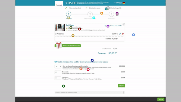
The new checkout: a detailed overview
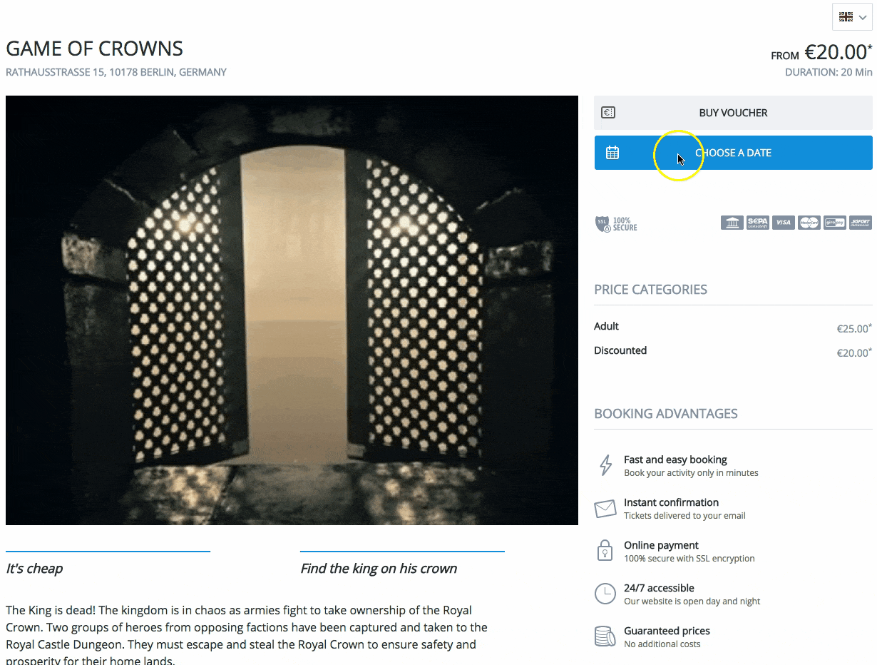
We know how hard it can be just to get potential customers to visit your website. Once this initial hurdle is out of the way, it goes without saying that you want to make sure visitors stick around, browse through your activities, and actually book something. Having compelling content is obviously very important, but there are also other factors at play which are crucial to turning page visitors into paying customers.
More clarity, better ease of use
The new bookingkit checkout is all about clarity. To make booking even easier, we’ve added a series of helpful and informative cues that guide bookers confidently and comfortably through the entire checkout process — no more worries about clicking the wrong button or getting lost along the way. With Widget 2.0 and Checkout 2.0, your tours and activities have never been easier to book.
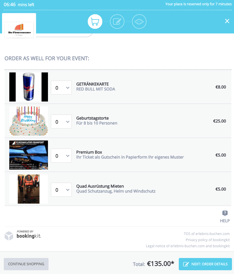
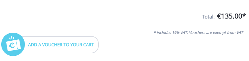
Improved visuals sell more coupons and add-ons
Pictures are powerful storytelling tools (they’re worth a thousand words after all), but did you also know they can significantly boost sales? When it comes to coupons and add-ons — one of the biggest sources of revenue for tour and activity providers — visuals are vital to guiding the customer’s eyes to your products and services. With this in mind, we designed the look and feel of the new bookingkit checkout to maximize the attention-grabbing power of visuals. Have a look for yourself:
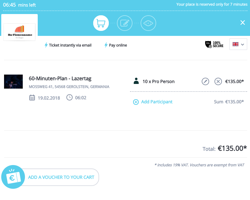
More of what matters, less of what doesn’t
This is the philosophy behind how the new bookingkit displays tour and activity information (e.g. available spots) and how it collects customer information. The shopping cart now features a much wider range of customizable options to meet your personal needs and tastes, including the ability to custom configure the information bookingkit requests from customers during checkout. This makes the booking process faster, easier and more comfortable for you and your customers.
Standards, trends and best practices: making bookingkit better every day
We’re always looking for ways to improve our software to make your business more efficient, more competitive and more profitable. Not only do we develop bookingkit features to keep you up to date with the latest e-commerce standards and trends, we also keep a close eye on what actually works for your business and others like it in order to provide the best software logic and design for your customers. At the end of the day, they’re the key to your success — and ours.
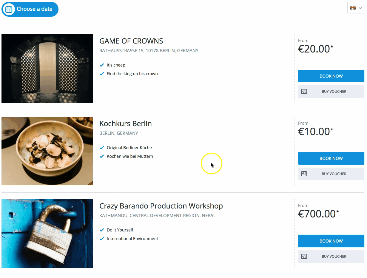
Fresh widget design
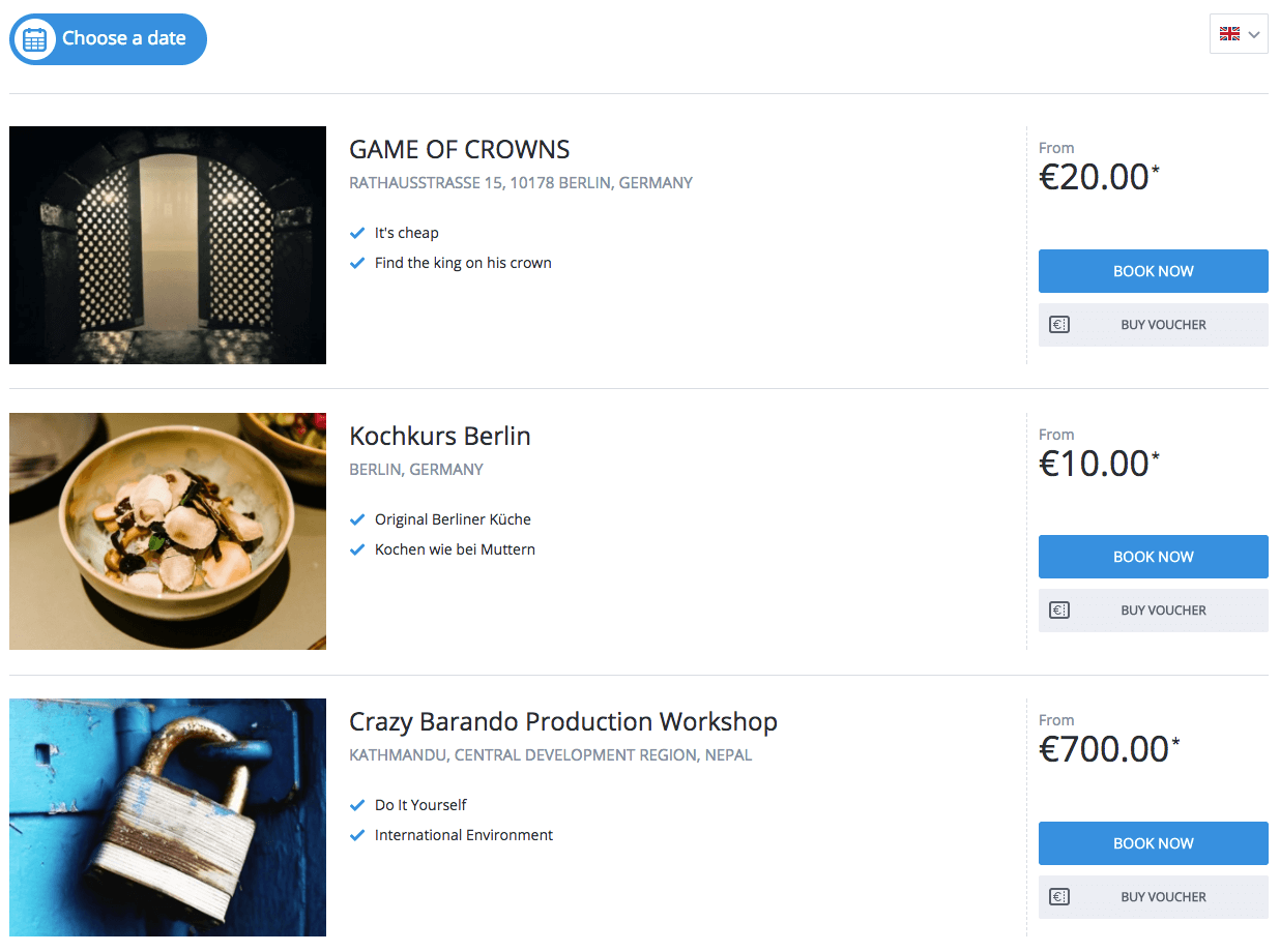
The new widget is clean, elegant and modern. As you can see from the images we’ve provided here, our main focus was to give the new widget a revamped look and feel to bring it in line with today’s software and web design standards. We also added new features and improved old ones. Now your customers can get an even quicker overview of your tours and activities: With the calendar overview, customers can see directly which days have tours or activities available, and when they select an available date, they’re presented with a convenient list of all the tours and activities for that day arrange by time.
Less text, more color
Getting the visitor’s attention is often half the battle when it comes to turning them into a paying customer. bookingkit’s buttons now feature much stronger colors designed to guide visitors directly into the booking process.
Plus, we’ve made the font sizes bigger and made the tour and activity descriptions more compact to keep everything short, sweet and more readable. And if you want to provide more textual information on your activities, there’s an option for that too.
How we know what works best
Conversion optimization with eye tracking
How this benefits you
With a series of tests and comparisons, we are able to find the look and feel that works best for your website and makes the entire process — from selecting an activity to paying online — easier and more understandable.
Here’s how we do it
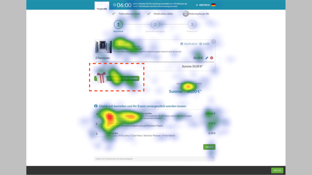
In this specific test scenario, we wanted to find out if the coupon booster generated more conversions than the normal “Add Coupon” feature.

Heatmap analysis
When we look at the heatmap analysis, we see that the “Add Coupon” button gets hardly any attention at all:
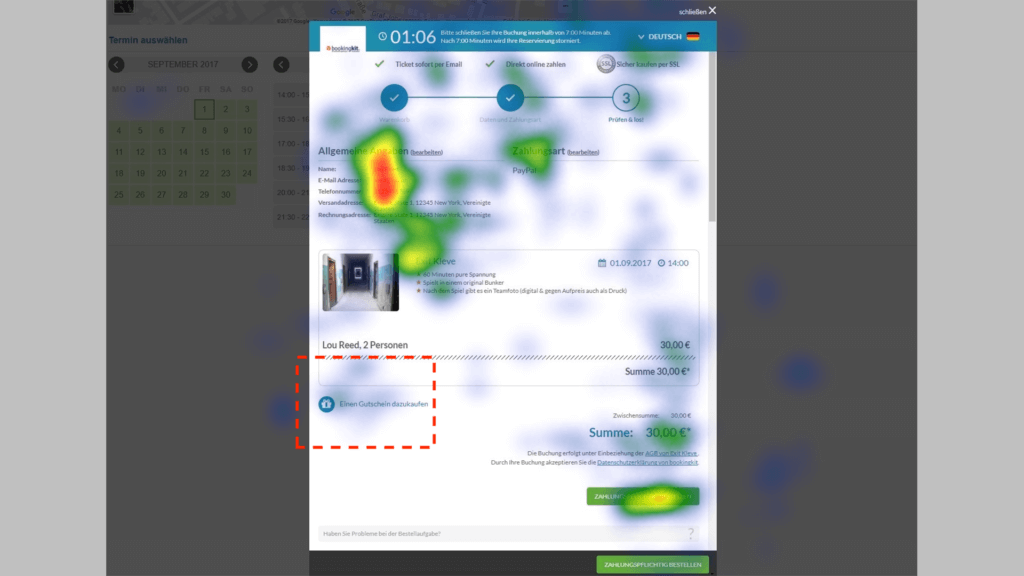
The coupon booster, by contrast, draws significantly more attention from the user:
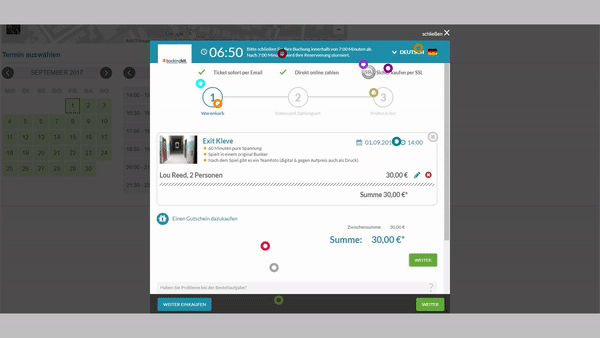
Beeswarm analysis
The results of the beeswarm analysis show precisely the same thing. Without the coupon booster, the user pays very little attention to the “Add Coupon” button:
Once again, the coupon booster gets much more attention from the user:

Frank Scheibe
Frank is a tours and activities industry expert. He reports on the latest facts, figures and trends in the bookingkit blog and the bookingkit newsletter. In his free time, he enjoys spending time with his kids and family, playing sports and eating good food.
Want to learn more about how bookingkit can help you drive conversions and get more bookings on your website?
Then get your free demo now.
Related articles
Industry & Trends
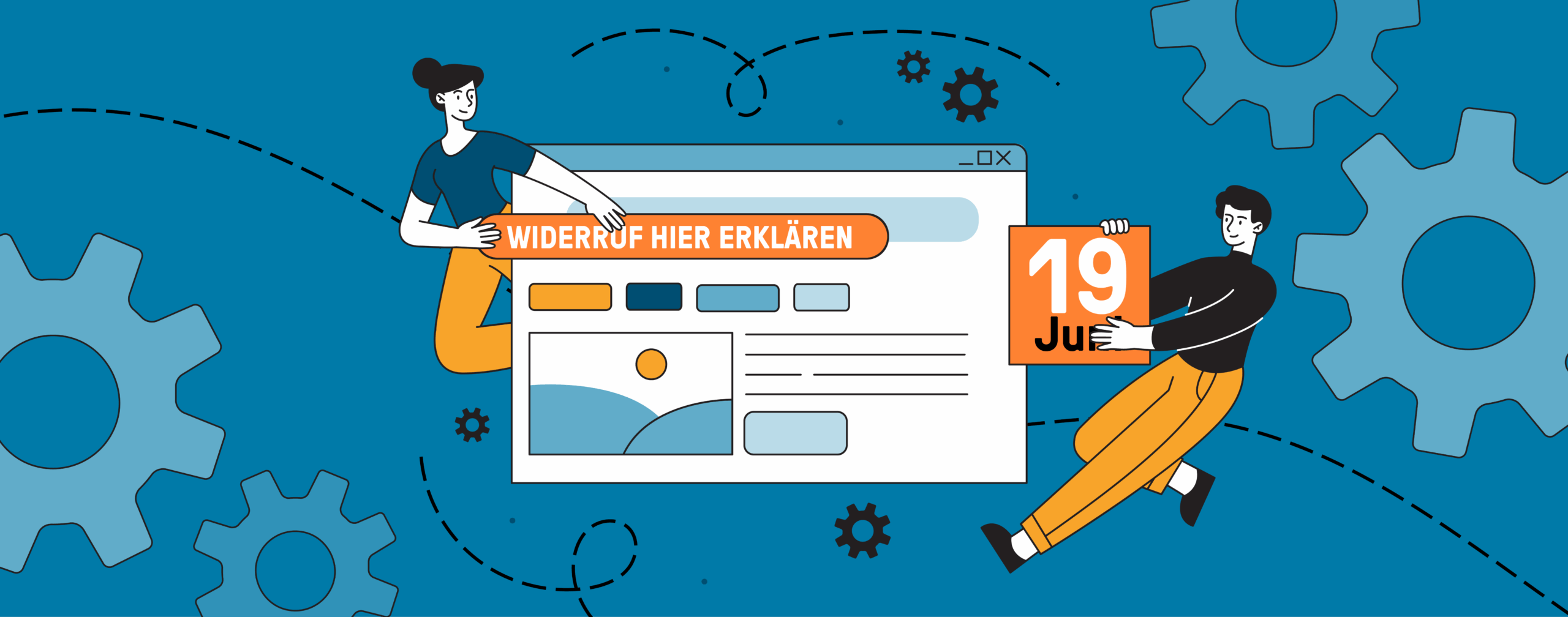
The Experience Operator’s Guide to the EU Withdrawal Button
The Experience Operator's Guide to the EU Withdrawal Button: What's Exempt, What Isn't, and How to Comply until June 19, 2026 June 19, 2026 is the date that every experience operator in Germany — and across the European Union — should have circled on their calendar That's when a new ...

Industry & Trends
Europa-Park relies on bookingkit for digital multichannel ticket distribution
We are proud to announce a partnership that holds special significance for us: Europa-Park, Germany's largest theme park, will rely on bookingkit as its technology partner for the online distribution of experiences moving forward With over seven million guests per year, the Europa-Park Resort ...

Press Release
Europa-Park and bookingkit Launch Technology Partnership for Digital Multichannel Ticket Sales
Germany's largest amusement park is expanding its digital infrastructure and will rely on bookingkit as its technology partner for the online distribution of experiences The Berlin-based software provider is one of Europe's leading platforms for booking, marketing, and managing leisure activities ...
Industry & Trends
bookingkit Leisure Market Index – April 2026
European leisure stays resilient: April revenue clears the historic 2024 peak, visitor numbers hold at peak levels, price volatility re-emerges Each month, bookingkit analyses aggregated booking and revenue data from thousands of leisure providers across Europe The April 2026 results confirm ...
Press Release
bookingkit appoints Megan Frydel as COO
Experienced operations leader joins Europe's leading experience booking platform to drive sustainable growth and organisational scale bookingkit, the One Platform for Attractions and the leading European booking and administration solution, has appointed Megan Frydel as its new Chief Operating ...
Industry & Trends
bookingkit Leisure Market Index – March 2026 / Q1 2026
Record Q1 2026: Geopolitical shifts drive European leisure demand as visitor-led growth returns for the first time since 2024 Each month, bookingkit analyses aggregated booking and revenue data from thousands of leisure providers across Europe The latest insights for March and the full first ...